
In a world increasingly defined by sedentary routines and silent health crises, a modest symbol is quietly rallying a global community toward change. At the heart of this awakening is the Waka Community International Foundation, a Nigerian-born non-profit redefining wellness through simplicity, discipline and collective action.
Founded in September 2021, the foundation has steadily carved a niche in preventive health advocacy, championing habits that are as accessible as they are transformative. Walking, mindful eating, proper hydration and quality sleep form the pillars of its outreach, offering a practical pathway to healthier living.
The organisation’s mission is both clear and compelling: to nurture a vibrant, inclusive network of individuals committed to living fitter, healthier and happier lives. It is a vision anchored not in complexity, but in the power of consistency and community.
Its name, “Waka,” drawn from Nigerian Pidgin for “to walk,” is more than a linguistic choice; it is a philosophy. It captures movement not just as physical activity, but as a metaphor for progress, resilience and lifelong wellness.
This philosophy is further echoed in its spirited taglines, including “AbsoWAKAlutely Wakamazing,” “Waka makes Sense,” and “Waka for Life,” each reinforcing a culture of joy and transformation embedded in everyday routines.
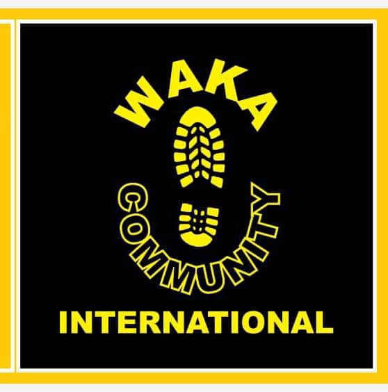
Yet, beyond words, it is the foundation’s logo that offers the most striking visual expression of its identity. Designed with bold yellow elements set against a solid black background, the emblem commands attention while communicating purpose with clarity.
At its centre lies a distinctive yellow footprint, encircled by the words “WAKA COMMUNITY INTERNATIONAL,” a deliberate arrangement symbolising movement, direction and collective progress. The design’s simplicity enhances its memorability, ensuring strong visibility across platforms ranging from social media to global billboards.
The choice of yellow is deliberate and evocative. It radiates energy, optimism and vitality qualities essential to inspiring active lifestyles. In the African cultural context, it also reflects prosperity and enlightenment, reinforcing the belief that health remains the truest form of wealth.
Black, by contrast, grounds the narrative. It speaks of strength, resilience and unity, echoing both the discipline required to sustain healthy habits and the enduring spirit of the people the foundation represents. Together, the colours create a compelling visual balance that is both inviting and empowering.
As the foundation expands its reach through initiatives such as Wakathons, community walks, nutrition programmes and mental health advocacy, its logo has evolved into more than a design, it is now a rallying emblem for change. And in that symbol lies a simple but powerful invitation: to step forward, together, and keep changing lives one Waka at a time.